skip to main |
skip to sidebar


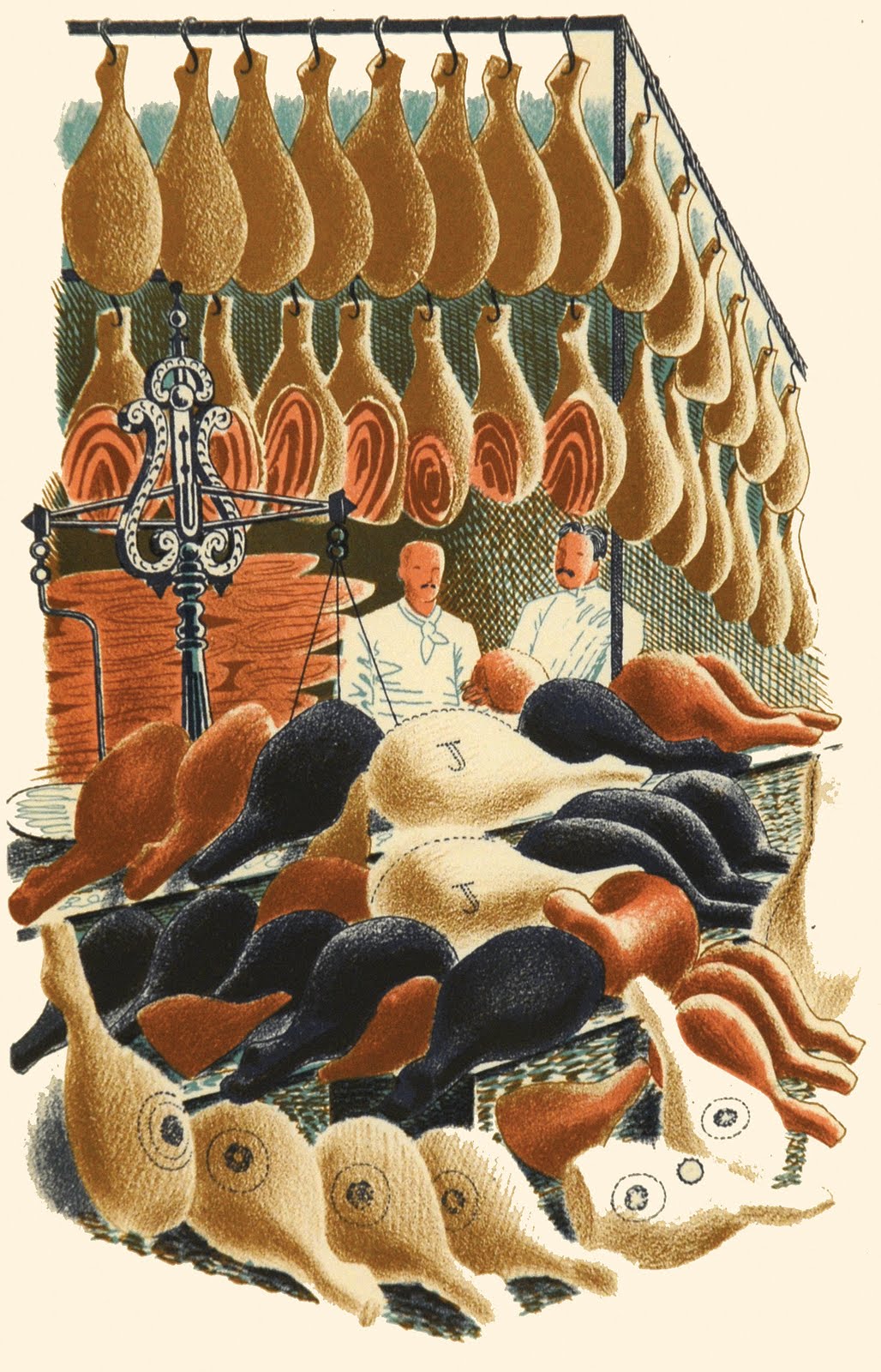
 The latest online Goldmark catalogue is out now, and Lord Carrot is very pleased to see in it a selection of original Eric Ravilious lithographs from the inestimable High Street. Widely recognised as being amongst the finest illustrations of their kind in the 20th century, the walls of Carrot Hall would have the lot up there. The stories they tell of High Streets gone by is one thing, but of equal interest are the idiosyncratic choices of shops, chosen as much, one suspects, for their extreme drawability and, well, fun. As much as I like Edward Bawden, Eric's best friend and companion-in-arts, he could be a bit of a curmudgeon (to say the least) but Ravilious appeared to never take himself that seriously. Often photographed with a fag on (I wish someone could tell me what brand- I imagine untipped Gold Flake) he seemed to really enjoy his life before sadly losing it so prematurely in cold Icelandic waters during the Second World War. The family butcher and hardware shops are here, but also a plumassier, firework seller (Ravilious loved fireworks) and the inevitable undertakers. Does Lord Carrot have a favourite? That's very hard, but I keep going back to those scrumptious hams.

 These posters really do have to be seen to be believed. All too familiar from reproductions in books, they are as close to the original large posters that got stuck up on those ubiquitous advertising columns (colonnes Morris) on the Paris streets of the 1890s as it's possible to be. In fact, they're even better. The print runs of the large posters were extended so that collectors could eagerly buy them for their truly awesome designs. But because you needed a fairly large salon to show them off, the original printers, Imprimerie Chaix, sent four reduced copies every month to subscribers, from December 1895 to November 1900. The gallery has a first set here now. The man behind it all deserves to be in the pantheon of graphic designers that these days would include Milton Glaser, Saul Bass and Alan Fletcher. Jules Cheret (there's an acute accent on the first 'e') was not only a formidable artist in his own right, but his three-stone lithographic process meant that designers were quick to recognise that their work would be displayed for everyone in rich, vivid colours. And it wasn't just Parisien or indeed French designers that benefitted. Alongside the instantly recognisable Lautrec and Mucha are the Beggarstaff Brothers and Maxfield Parrish. You can find out more here, but be quick, I'm trying to find a way of smuggling them out round the back where's there's an easy climb over the wall to the car park.
 Every Friday we have an open-air market just around from the corner from the gallery in Uppingham's square. (Mike's round there now, getting the fish.) Which means we all enjoy a fabulous source for fresh fruit & veg, local cheeses, trilby hats, nail brushes, olives, watch batteries, pork pies and the added bonus of not being able to park anywhere. So if you're thinking of coming and seeing what's on offer at Goldmark's, make it a Friday. If you don't all come at once you can join us for lunch, where you'll find those same cheeses, charcuterie and a box of Carr's Melts (you have to be quick to get your hand in that). The only trouble is, being surrounded by such colourful art everyday, you can't help seeing it everywhere else, hence this abstract. I'm calling it Orange, Limone, Blue & Green Study. With 'Orange' pronounced 'Orraahnge' obviously.


 The latest online Goldmark catalogue is out now, and Lord Carrot is very pleased to see in it a selection of original Eric Ravilious lithographs from the inestimable High Street. Widely recognised as being amongst the finest illustrations of their kind in the 20th century, the walls of Carrot Hall would have the lot up there. The stories they tell of High Streets gone by is one thing, but of equal interest are the idiosyncratic choices of shops, chosen as much, one suspects, for their extreme drawability and, well, fun. As much as I like Edward Bawden, Eric's best friend and companion-in-arts, he could be a bit of a curmudgeon (to say the least) but Ravilious appeared to never take himself that seriously. Often photographed with a fag on (I wish someone could tell me what brand- I imagine untipped Gold Flake) he seemed to really enjoy his life before sadly losing it so prematurely in cold Icelandic waters during the Second World War. The family butcher and hardware shops are here, but also a plumassier, firework seller (Ravilious loved fireworks) and the inevitable undertakers. Does Lord Carrot have a favourite? That's very hard, but I keep going back to those scrumptious hams.


